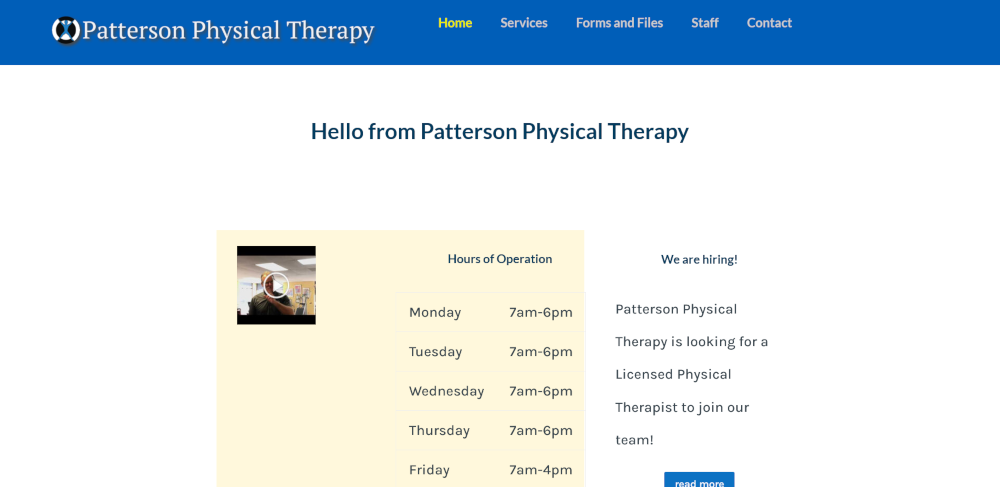
This was my first website build.
I am happy with it, even though it was my first. I feel the colors are inviting, the user experience is good and the overall website flows.
Decisions
Main navigation menu
The main navigation is seen on each page, so I opted to show only the most important choices.
Typography
The majority of the website’s users are of the aging population. Therefore, I chose a legible sans-serif typeface and a large line-height.
Colors
The branding colors are blue, black and white. I used those colors, and I tried to give an inviting feel to the site.
NO to the hamburger menu!
I do not like the hamburger menu as I feel it hides information from the users.

